Mich haben viele Leser gefragt ob es möglich ist einen Schalter am Raspi 2 anzubringen. Dies hat mir den Anlass gegeben diesen Artikel zu schreiben.
Es ist wirklich einfach und vor allem schnell gemacht. Der Raspberry Pi 2 hat bereits eine Schnittstelle an dem wir einfach einen Schalter anbringen können.
Lästige Scripte muss man hierbei nicht im Nachhinein installieren. Der Schalter funktioniert direkt nach dem Einbau. 🙂
Wie funktioniert dieser Schalter?
Es handelt sich hierbei um einen Taster der beim drücken kurz den Kontakt überbrückt und dadurch den Raspberry startet. Selbes Prinzip wie bei einem PC.
Wenn man diesen Taster im laufenden Betrieb betätigt wird ein Reset durchgeführt und der Raspi startet neu.
Ausschalten kannst du den Pi wie gewohnt einfach über das Betriebssystem.
Was wird benötigt?
Folgende Bauteile habe ich verwendet:
| Bauteil | Empfehlung |
|---|---|
| beliebiger Schalter (Taster) | ab 2,00 € |
| Steckkabel | 1,43 € |
| Stiftleiste | 3,00 € |
| [Optional] Schrumpfschläuche | 5,70 € |
| [Optional] Kabelummantelung (Sleeve) | ca. 4,00 € |
Als Bastler hat man bestimmt das ein oder andere bereits im Sortiment. Es ist auch gar nicht notwendig eine Stiftleiste anzulöten, man kann auch das Kabel direkt am Pi löten, nur ist dann das entfernen des Schalters nicht mehr so schnell möglich.
Anstatt Schrumpfschläche kann man auch billiges Isolierband nehmen oder aber auch die Kontakte nackt lassen da die Kurzschlussgefahr doch eher gering ist.
Schalter installieren!
Wie bereits erwähnt, ist beim Raspberry Pi eine Schnittstelle vorhanden an der man einen Schalter (Taster) anbringen kann.
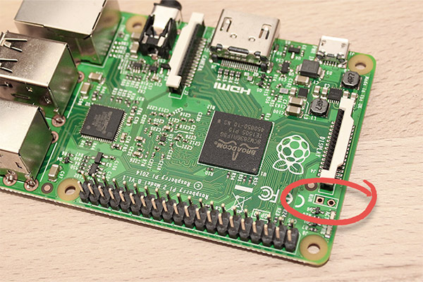
Ich habe bei an dieser Stelle zwei Stifte dran gelötet damit ich bei Bedarf den Schalter jederzeit entfernen kann. Die Lötpunkte wurden hierbei auf der Rückseite gesetzt. Wenn du keine Stiftleiste besitzt, kannst du auch einfach das Kabel direkt an die Kontakte anlöten.
So sieht der angelötete Stiftsockel aus:
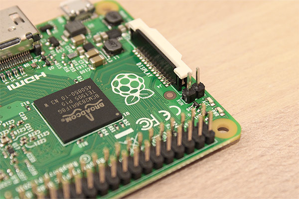
Das war es im Endeffekt auch schon. Nun kann man einfach seinen Schalter an diesen Stiftsockel anschließen und dadurch den Pi jederzeit einschalten oder resetten.
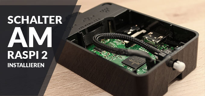
Ich hatte noch einen alten Einschalter vom PC rumliegen den ich hier benutzt habe. Dafür habe ich ein kleines Loch am Gehäuse gebohrt und den Schalter mit Heißkleber von der Innenseite befestigt sodass nur der Knopf heraus guckt.
Für die Optik habe ich das Kabel noch mit einem Sleeve ummantelt und mit Schrumpfschläuchen (Schläuche die sich bei Hitze zusammenziehen) isoliert.
So sieht das fertige Projekt bei mir aus:
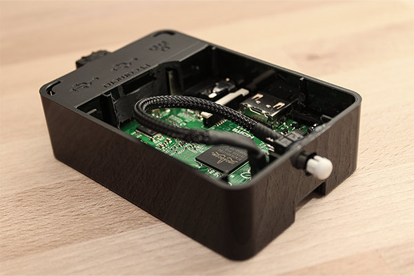
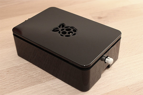
Bei dem Gehäuse im Bild handelt es sich um das „OneNineDesign“ Gehäuse für den Raspberry B+. Wer Interesse daran hat sollte beachten dass man eine kleine Plastikecke im inneren abknipsen muss damit der Raspberry Pi 2 passt.
Um dort noch auch noch einen Schalter unterzubringen muss man auch wieder etwas Plastik im inneren entfernen. Nur als Info.









This is getting a bit more subjective, but I much prefer the Zune Marketplace. The interface is colorful, has more flair, and some cool features like ‚Mixview‘ that let you quickly see related albums, songs, or other users related to what you’re listening to. Clicking on one of those will center on that item, and another set of „neighbors“ will come into view, allowing you to navigate around exploring by similar artists, songs, or users. Speaking of users, the Zune „Social“ is also great fun, letting you find others with shared tastes and becoming friends with them. You then can listen to a playlist created based on an amalgamation of what all your friends are listening to, which is also enjoyable. Those concerned with privacy will be relieved to know you can prevent the public from seeing your personal listening habits if you so choose.
I’ll gear this review to 2 types of people: current Zune owners who are considering an upgrade, and people trying to decide between a Zune and an iPod. (There are other players worth considering out there, like the Sony Walkman X, but I hope this gives you enough info to make an informed decision of the Zune vs players other than the iPod line as well.)
This is getting a bit more subjective, but I much prefer the Zune Marketplace. The interface is colorful, has more flair, and some cool features like ‚Mixview‘ that let you quickly see related albums, songs, or other users related to what you’re listening to. Clicking on one of those will center on that item, and another set of „neighbors“ will come into view, allowing you to navigate around exploring by similar artists, songs, or users. Speaking of users, the Zune „Social“ is also great fun, letting you find others with shared tastes and becoming friends with them. You then can listen to a playlist created based on an amalgamation of what all your friends are listening to, which is also enjoyable. Those concerned with privacy will be relieved to know you can prevent the public from seeing your personal listening habits if you so choose.
Apple now has Rhapsody as an app, which is a great start, but it is currently hampered by the inability to store locally on your iPod, and has a dismal 64kbps bit rate. If this changes, then it will somewhat negate this advantage for the Zune, but the 10 songs per month will still be a big plus in Zune Pass‘ favor.
I’ll gear this review to 2 types of people: current Zune owners who are considering an upgrade, and people trying to decide between a Zune and an iPod. (There are other players worth considering out there, like the Sony Walkman X, but I hope this gives you enough info to make an informed decision of the Zune vs players other than the iPod line as well.)
If you’re still on the fence: grab your favorite earphones, head down to a Best Buy and ask to plug them into a Zune then an iPod and see which one sounds better to you, and which interface makes you smile more. Then you’ll know which is right for you.
Zune and iPod: Most people compare the Zune to the Touch, but after seeing how slim and surprisingly small and light it is, I consider it to be a rather unique hybrid that combines qualities of both the Touch and the Nano. It’s very colorful and lovely OLED screen is slightly smaller than the touch screen, but the player itself feels quite a bit smaller and lighter. It weighs about 2/3 as much, and is noticeably smaller in width and height, while being just a hair thicker.
If you’re still on the fence: grab your favorite earphones, head down to a Best Buy and ask to plug them into a Zune then an iPod and see which one sounds better to you, and which interface makes you smile more. Then you’ll know which is right for you.
I’ll gear this review to 2 types of people: current Zune owners who are considering an upgrade, and people trying to decide between a Zune and an iPod. (There are other players worth considering out there, like the Sony Walkman X, but I hope this gives you enough info to make an informed decision of the Zune vs players other than the iPod line as well.)
Hands down, Apple’s app store wins by a mile. It’s a huge selection of all sorts of apps vs a rather sad selection of a handful for Zune. Microsoft has plans, especially in the realm of games, but I’m not sure I’d want to bet on the future if this aspect is important to you. The iPod is a much better choice in that case.
Apple now has Rhapsody as an app, which is a great start, but it is currently hampered by the inability to store locally on your iPod, and has a dismal 64kbps bit rate. If this changes, then it will somewhat negate this advantage for the Zune, but the 10 songs per month will still be a big plus in Zune Pass‘ favor.
Hands down, Apple’s app store wins by a mile. It’s a huge selection of all sorts of apps vs a rather sad selection of a handful for Zune. Microsoft has plans, especially in the realm of games, but I’m not sure I’d want to bet on the future if this aspect is important to you. The iPod is a much better choice in that case.
This is getting a bit more subjective, but I much prefer the Zune Marketplace. The interface is colorful, has more flair, and some cool features like ‚Mixview‘ that let you quickly see related albums, songs, or other users related to what you’re listening to. Clicking on one of those will center on that item, and another set of „neighbors“ will come into view, allowing you to navigate around exploring by similar artists, songs, or users. Speaking of users, the Zune „Social“ is also great fun, letting you find others with shared tastes and becoming friends with them. You then can listen to a playlist created based on an amalgamation of what all your friends are listening to, which is also enjoyable. Those concerned with privacy will be relieved to know you can prevent the public from seeing your personal listening habits if you so choose.
This is getting a bit more subjective, but I much prefer the Zune Marketplace. The interface is colorful, has more flair, and some cool features like ‚Mixview‘ that let you quickly see related albums, songs, or other users related to what you’re listening to. Clicking on one of those will center on that item, and another set of „neighbors“ will come into view, allowing you to navigate around exploring by similar artists, songs, or users. Speaking of users, the Zune „Social“ is also great fun, letting you find others with shared tastes and becoming friends with them. You then can listen to a playlist created based on an amalgamation of what all your friends are listening to, which is also enjoyable. Those concerned with privacy will be relieved to know you can prevent the public from seeing your personal listening habits if you so choose.
Zune and iPod: Most people compare the Zune to the Touch, but after seeing how slim and surprisingly small and light it is, I consider it to be a rather unique hybrid that combines qualities of both the Touch and the Nano. It’s very colorful and lovely OLED screen is slightly smaller than the touch screen, but the player itself feels quite a bit smaller and lighter. It weighs about 2/3 as much, and is noticeably smaller in width and height, while being just a hair thicker.
Hands down, Apple’s app store wins by a mile. It’s a huge selection of all sorts of apps vs a rather sad selection of a handful for Zune. Microsoft has plans, especially in the realm of games, but I’m not sure I’d want to bet on the future if this aspect is important to you. The iPod is a much better choice in that case.
Zune and iPod: Most people compare the Zune to the Touch, but after seeing how slim and surprisingly small and light it is, I consider it to be a rather unique hybrid that combines qualities of both the Touch and the Nano. It’s very colorful and lovely OLED screen is slightly smaller than the touch screen, but the player itself feels quite a bit smaller and lighter. It weighs about 2/3 as much, and is noticeably smaller in width and height, while being just a hair thicker.
I’ll gear this review to 2 types of people: current Zune owners who are considering an upgrade, and people trying to decide between a Zune and an iPod. (There are other players worth considering out there, like the Sony Walkman X, but I hope this gives you enough info to make an informed decision of the Zune vs players other than the iPod line as well.)
Zune and iPod: Most people compare the Zune to the Touch, but after seeing how slim and surprisingly small and light it is, I consider it to be a rather unique hybrid that combines qualities of both the Touch and the Nano. It’s very colorful and lovely OLED screen is slightly smaller than the touch screen, but the player itself feels quite a bit smaller and lighter. It weighs about 2/3 as much, and is noticeably smaller in width and height, while being just a hair thicker.
If you’re still on the fence: grab your favorite earphones, head down to a Best Buy and ask to plug them into a Zune then an iPod and see which one sounds better to you, and which interface makes you smile more. Then you’ll know which is right for you.
This is getting a bit more subjective, but I much prefer the Zune Marketplace. The interface is colorful, has more flair, and some cool features like ‚Mixview‘ that let you quickly see related albums, songs, or other users related to what you’re listening to. Clicking on one of those will center on that item, and another set of „neighbors“ will come into view, allowing you to navigate around exploring by similar artists, songs, or users. Speaking of users, the Zune „Social“ is also great fun, letting you find others with shared tastes and becoming friends with them. You then can listen to a playlist created based on an amalgamation of what all your friends are listening to, which is also enjoyable. Those concerned with privacy will be relieved to know you can prevent the public from seeing your personal listening habits if you so choose.
Hands down, Apple’s app store wins by a mile. It’s a huge selection of all sorts of apps vs a rather sad selection of a handful for Zune. Microsoft has plans, especially in the realm of games, but I’m not sure I’d want to bet on the future if this aspect is important to you. The iPod is a much better choice in that case.
Apple now has Rhapsody as an app, which is a great start, but it is currently hampered by the inability to store locally on your iPod, and has a dismal 64kbps bit rate. If this changes, then it will somewhat negate this advantage for the Zune, but the 10 songs per month will still be a big plus in Zune Pass‘ favor.
I’ll gear this review to 2 types of people: current Zune owners who are considering an upgrade, and people trying to decide between a Zune and an iPod. (There are other players worth considering out there, like the Sony Walkman X, but I hope this gives you enough info to make an informed decision of the Zune vs players other than the iPod line as well.)
Hands down, Apple’s app store wins by a mile. It’s a huge selection of all sorts of apps vs a rather sad selection of a handful for Zune. Microsoft has plans, especially in the realm of games, but I’m not sure I’d want to bet on the future if this aspect is important to you. The iPod is a much better choice in that case.
Apple now has Rhapsody as an app, which is a great start, but it is currently hampered by the inability to store locally on your iPod, and has a dismal 64kbps bit rate. If this changes, then it will somewhat negate this advantage for the Zune, but the 10 songs per month will still be a big plus in Zune Pass‘ favor.
Hands down, Apple’s app store wins by a mile. It’s a huge selection of all sorts of apps vs a rather sad selection of a handful for Zune. Microsoft has plans, especially in the realm of games, but I’m not sure I’d want to bet on the future if this aspect is important to you. The iPod is a much better choice in that case.
If you’re still on the fence: grab your favorite earphones, head down to a Best Buy and ask to plug them into a Zune then an iPod and see which one sounds better to you, and which interface makes you smile more. Then you’ll know which is right for you.